Grouped Run Data/Charts for EEMC Calibration
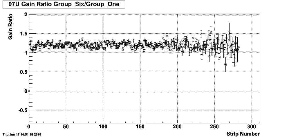
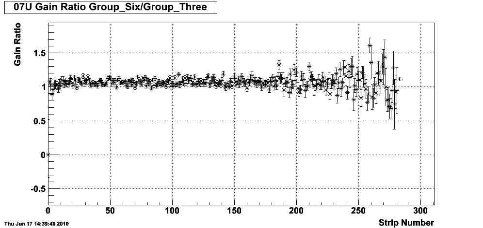
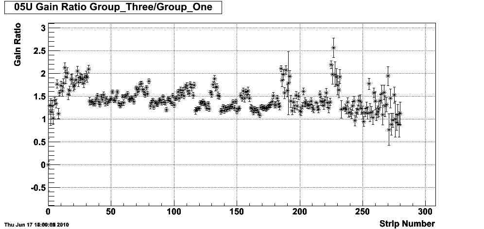
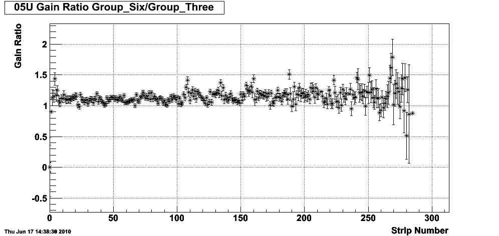
Update: I created graphs for comparing the 6th group to the 3rd group and the 3rd group to the 1st group. I also corrected the titles on the first graphs. Most of the large variations and apparent outliers in the data seem to disappear when comparing the 6th group to the 3rd group, but they are still present when comparing groups 3 and 1. It is not apparent why this is. Work needs to be done redoing these graphs to have a consistent scale and to mark bad strips as opposed to throwing them out, so we can better spot any trends.
----------------------------------------------------------------------------------------------------------------------------------------------------------------------------------------------------
In order to see how the gains have varied with time we split the list of runs we were using into six groups, each including 23 runs and spanning 10-12 days (the runs and grouping can be seen in the attached Excel file). We compared the gains of the first and sixth groups for each sector from 1-12. Based on the ratio charts of the Group Six gains over the Group One gains (or Group One slope over Group Six slope), there appears to be a general trend of a ~10-30% increase in the gains in that time with a good amount of scatter.
The charts can be found on the STAR network at /star/u/nramm/cal/EEMC_cal/gaincharts
Here's fairly representative ratio chart for the data.

Sectors 5, 8, and 12 showed some strong oscillations in the gain ratio, with sector 5 being the most extreme (shown below).
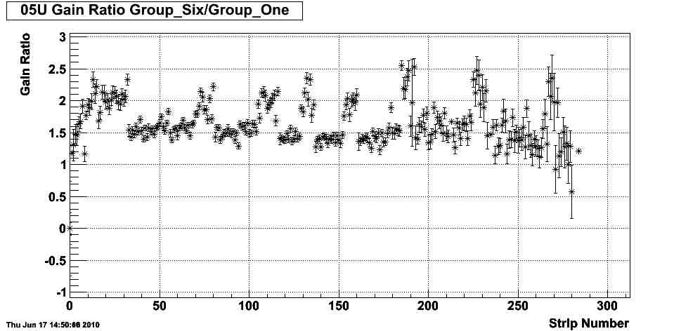
Update 6-18-10: For comparison here are the charts for the same sector comparing Group 3 to 1 and Group 6 to 3.
This seems to suggest that whatever is causing the changes in the gains is happening fairly early in the runs.
- nramm's blog
- Login or register to post comments